Thursday, September 29, 2011

If I have said it before.....

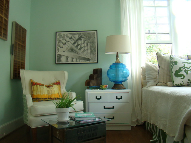
As you can see, I have already thrown another pillow around.  It's called Musical Pillows in my house!
I've said it 10000 times...lack of money doesn't have to mean lack of style. P.E.R.I.O.D  In this case, I speak of drapes/curtains.

If I could afford, professionally sewn, european linen drapes, I would, but I can't, sooooooo...... true to form, not to be deterred by lack of funds for drapes (priorities people!).....I reworked some IKEA RITVA curtains. 


Not the look I was going for...
and just because they come with tie backs doesn't mean you have to use them!


Who says out of the box curtains have to look like they are out of the box?   Did you know how EASY making pinch pleats are and what an IMPACT they make in a room.   I hear you already.... "I don't have a sewing machine", or "I can't sew!".....no excuses these are EASY, PEASY!  These can be made with a needle and thread, although a sewing machine does make it easier:):)

Now you don't have to use IKEA, but any curtains that have the hidden rod pockets in the header will work. 

It gives the illusion of drapery tape, and the heft needed to make the pleats stay.  Plus, if you are a lazy sewer, like I am....they are already measured out, all you have to do is pinch and sew.


Here are the steps.

Find the rod pocket part of the draper

See they are spaced evenly apart.

Pinch like this.

Continue with all of the rod pockets until finished.
 Use some of these little suckers....drapery hooks from Joanns or  Lowes or local drapery place.


Et, Voila!

Look so much better....and have such a a better drape.
Now, you can trim out to your heart's content.  Using things like


Greek Key trim,


or grograin ribbon,


or even a ruffle if you are feeling daring.

Or if you are feeling really daring....cut the bottoms and add some contrasting fabric to the bottom....you would only need a couple yards.

Seriously, just because it comes one way in the box doesn't mean it has to stay that way.
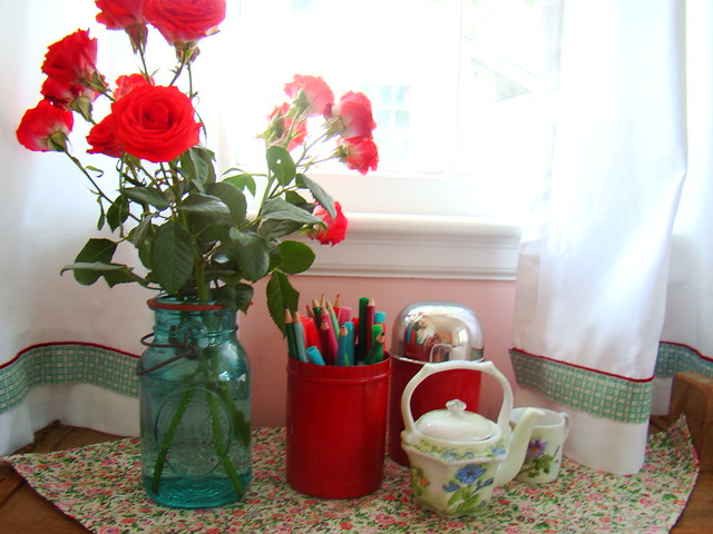

These were cafe curtains out of the box at target....with vintage trim and leftover red fabric

I added a red fabric and trim to the bottoms of these to make them different.


Sew there you have it....out of the box curtains turned to nice drapes...all for $50, $100 less than an inexpensive drapery panel.

Happy Thursday.

Tuesday, September 27, 2011

The U Turn


You all know what I am talking about,.....

the big ol' U turn that you do, when you see a potential piece on the side of the road!  The one where the kids say, "Mom, don't stop!  You have the fleeting thought that you might be a little crazy, but the pitter patter in the ol thumper starts pittering a little faster, and patttering a little harder, and you just HAVE to stop.  Pull a Uuy and jump out....throw the piece into the car, and live with the consequences of the eye rolls, and husband's jeering when you get home.  And you say....


You'll see:)

My side of the road find.
Table that cost $0!

I am here to show you that this one was worth it.  I am here to prove that shopping on the side of the road is not so bad!  People throw things out all the time that they are tired of, that might be a little broken, or in this case was just ugly.  But, being true to my Penchant for Potential....I knew this would be a nice little piece.

All it needed was a little paint....white in this case. white.  I spray painted the hardware green and

VOILA!

Here's to finding your next diamond on the side of the road!

Monday, September 26, 2011

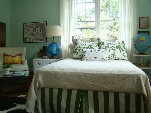
The Guest Room Studio Reveal

Me drinking a glass of Vino in my  favorite spot!
Like I said last week, I have been out, but I have just been really busy.  Lots of projects, work, etc...and my family.  As Balance is integral in great design, graphic or interior....BALANCE is one of the things that makes a family work....so I am working on all 3, family being at the top of the triangle.  I would say I am getting close, but not quite there.  So, if posts are spotty sometimes, you know I am working on the "B" word!

Anyhoo...

This week, is going to be all about my guest room/studio.

I'm not a girl that likes to go by the rules (if there are any) of reveals...and I am so excited about this one, that I just can't help myself.   Instead of having a reveal AFTER I show all of the projects in progress, I am going to go ahead and show the WHOLE reveal.  THEN  I'll show you what I did with all of the projects.  I tried to take pictures as I was doing everything, but sometimes I was so frenzied I forgot...please forgive me.

This project started, as many of my personal projects do, "Hmmmm, what am I going to do today....I guess I will get started on the studio."  And then the Snowball started rolling down the mountain!  I decided to challenge myself to get it done in a week.  I am proud to say, it is done. Whew!

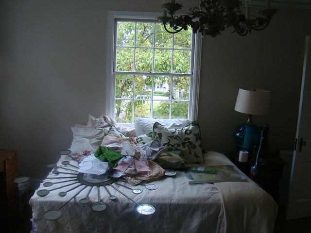
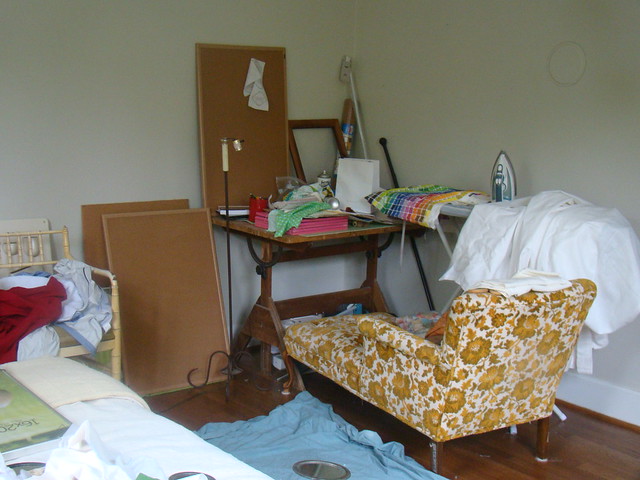
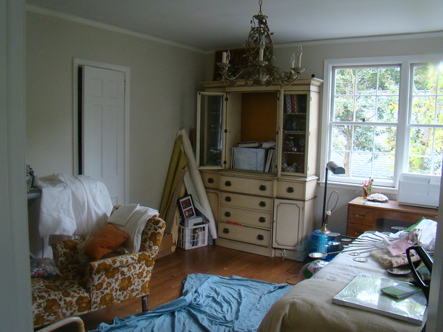
As a small reminder, here are the before pics.  I am not proud of this, by any means.  The room had become a dumping ground, the closed door, the "don't you DARE look in that room!"....you get the picture.  I do admit the photos were taken as I started to unload the room, so it was much worse than usual....but makes for Fantastic Before and Afters!

Trying the bed as a daybed....bad Idea!
I really wanted the chaise to work, but it won't.   For another project or client.  super cute though.

Who could possibly create in this!


I started by taking my own advice....CLEAR THE ROOM....re-assess  the floor plan and your existing furniture. And go from there.  Just because you really want that big armoire and chaise (recovered of course) to work in the space (ie. Moi) doesn't mean it is going to!!!!!....find another home for it...in this case the armoire is filling a perfect space in my daughters room....and move on.  The room will be better because of it.

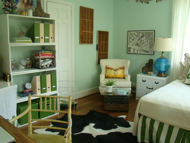
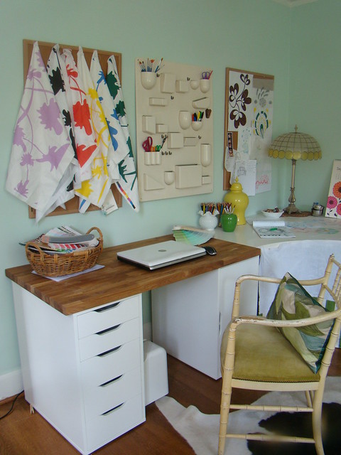
So I re-positioned the bed, and split the room down the middle lengthwise.  The guest room area, and the office area.  It is not a big room by any means...12X13.  With off-center windows and closets.  Challenging, but not the end of the world.

THE REVEAL!

Had to use my favorite colors...it IS my room afterall!

Filled with all of the things I love!

Now I MUST get to work!
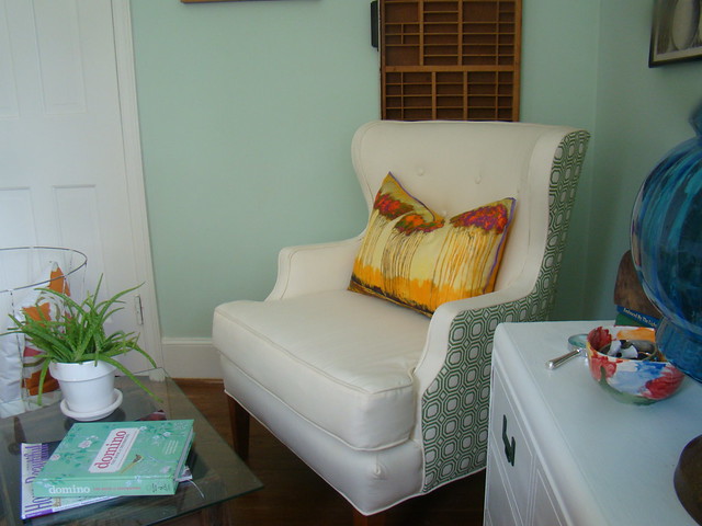
Luckily, my "Queen Bee" chair never sold.  I really wanted it for myself.  I am selfish like that!
A nice reading nook.  And place for my guest's to relax and retreat!

There you have it, ya'll. 

I really used mostly things that I had and that I love.  (my philosophy on design in general ) Now I have NO more excuses as to why I can't get it all done or have people stay!  I have a serene, creative space to get to work on all of those client projects that are trickling in!  AND a space to take in all of my guests! 


It works so well, I had a little Wine get togeather Thursday night when I finished.  2 of my close friends, me and my husband....and we all had a comfortable place to sit!  Who knew????:)  

I will go through the details this week.


Friday, September 23, 2011

1 Girl, 1 Room, 5 days

Studio D' Opgenorth:)
Hey All, I just wanted to let you know that I am still alive and working really hard.  This week has been a blur of activity an addition of a new client, and a collaboration with one of my vendors that is so exciting (more details as I get them!) and to top it all off, I finally got my studio/guest room finished!  You didn't know I was working on it, you say?  Well, neither did I, but when the work and emails start coming in, I thought it was time to have a space that was functional, and really all me!  I approached it like I was my  own client, taking my own advice, using my own tips!  I designed for the way I LIVE and CREATE!  And I did it ALL by myself!   Well, I did have a little help with the painting.


in the corner behind the door!

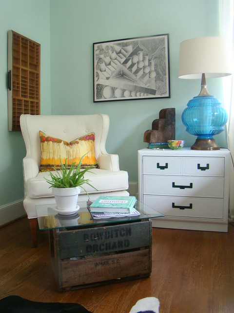
And Here is a peak att what it looked like before....the armoire is in the same corner as the above pic, it was moved out of the room into my daughters room....which she LOVES!  Sometimes you just have to move the furniture out of the room to see the space for what it is.

I know, really ya'll, now we have no junk room.  I must keep them all pretty!

And I will share it all next week.  All of the projects, before and afters, and tips that make the room!

I hope everyone has a restful weekend...I know I will.

Monday, September 19, 2011

I'm still here!

Apples, magazines, and old apple crates!

I know my posts have been spotty lately....been busy with life and  family. I know, I know, excuse, excuses...but it is what it is, and a girl has to prioritize sometimes.  Family first. 

Speaking of family, last Sunday, we went on our annual apple picking adventure in Hendersonville, NC.  At Stepps Apple Orchard...really such a fun!, and we end up with piles of apples of all kinds.  Last year we went a little late in the season, and the apples were slim pickins, but this time we got it together and went early.  Apples galore!


so many apples!

running amongst red delicious!
doesn't take long to fill up.
 All in all it was a wonderful day, and we have more apples than we know what to do with.  Tomorrow I will talk about why I had those magazines and the crates in the top photo.

Happy Monday, ya'll!  I've missed ya.


Wednesday, September 7, 2011

Color Stalking

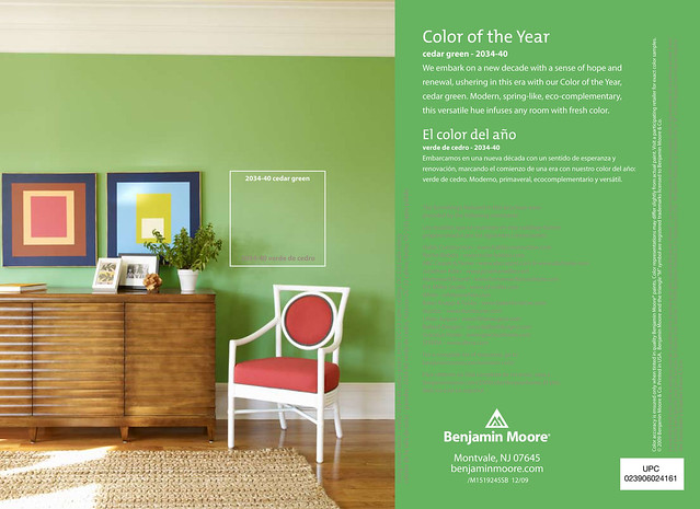
Does anyone else color stalk?  I mean, when you find a room that you love and HAVE to know the color, and then find the color, and then feel the need to find ALL of the rooms that have the same color, so that you might be able to see a room that looks similar to yours, and then see what YOUR room might look like with THAT color?  I must confess, I am a color stalker.  The color of the moment, Benjamin Moore Cedar Green.

Where it started...House Beautiful I think the March 2011 issue?

Via House Beautiful


This is all I could find from good ol' google.

From House Beautiful

Cedar Green
"Green is symbolic of growth. It also embodies another word that's going to be extremely important in the next decade, and that's 'flexibility.' Green goes with anything — just look outside. It can work with what you already own, as well as anything you'd like to add. It can feel classic or contemporary. And it's restful. It makes me feel balanced." —SONU MATHEW

Benjamin Moore Cedar Green...a winner in 2010. (I am always late to a party!)

I couldn't agree more.


Via House Beautiful...Designed by Steven Gambrel...OF COURSE!

via Ruth Burts Interiors
All I could find....I am really liking this striped wall with the Navy blue and pops of orange.

Even though it was an it color in 2010, I think it might be a keeper.  Going to the paint store NOW!   Happy Color Stalking ya'll.