Wednesday, July 27, 2011

Off to DCity

Tomorrow we leave for Washington DC for a few days.  We try to get up there a few times a year, because we have family.   I absolutely love all that DC has to offer...so much to see and do. I am quite lucky that the kids already know all of the museums (at the tender age of 4 and 6).  They want to go to the Air and Space and the Natural History, even though we were just there in the spring!  We might even go on a little Duck Tour.


Doesn't that look fun!
 ....something I have always wanted to do, and now that I am  the parent I get to indulge!  Even though I KNOW it is going to be drippingly hot, oh, well...the kids will have fun!  We did the Double Decker busses a few years ago, but they were so small, and it was so hot it was fairly miserable!

When we were in DC in March.  Love that they can just run down the mall!


one of my favorite houses...maybe because the front porch is similar to ours...but much prettier.

One of my favorite things to do is drive around the city...so much to explore.  The architecture and bridges are awesome. This bridge was in Rock Creek Park.  Ya'll if you haven't been to DC and just driven around, I would highly recommend it.  Really so much to see.

I am so lucky that my brother and sister live really close to Georgetown, so we get to go SHOPPING and wandering around.  The architecture in DC is beautiful.  I love to walk around Georgetown and dream of who lives in some of the houses.

The view off of my sister's roof top deck on her apartment.  The National Cathedral...just gorgeous!
"you can see the whole world from here!"

 Here are a few shots I took the last time I was there...I think I was thinking about the architectural detail, because the photos in general aren't that spectacular, compared to some things I have seen.  I will try to be better this time (most of the time, I am trying to coax my children along, while they whine about how much their legs hurt from walking, so I don't take the most artistic photos!)


Love all of the detail on this home.

The brickwork is beautiful...kind of art nouveaux.

The detail above the window is so cool...and I love brick with the white on it.

Another pretty roof.

I loved how they have made this brownstone very modern...look at the linear planters, door, and light fixture.

wrought iron galore!

I am staying thru Monday, so we will also attend the Georgetown Flea on Sunday which is always fun.

I really wanted this vintage rug last time...but didn't get it....the colors remind me of a peacock.
 Last but not least....one of my favorite photos from last summer was turned into a painting that I will treasure forever..maybe if I am lucky I get another.
There was a discrepancy as to WHO actually took the picture...my mom said it was me..but clearly it wasn't!
The oil painting on my collected wall in the Den.  Isn't she so talented!
One more thing ya'll, speaking of DCity...My friend Jill from Live Like You, just wrote the sweetest post about my home!  A little Bohemian Chic (I like the sound of that!) AND she is located in DCity too!  You must check out her blog...talk about Amazing use of color.     Here online store is so great....she creates rooms inspired my a specific look and you can buy some or ALL of the pieces to create the same look for your home.  She just launched Mamma Mia Look (one of my favorite broadway shows!).  She is graciously offering my readers 10% off.  Go shopping NOW!


Anyway, we leave tomorrow.  Might blog on the road...but don't be suprised if you don't hear from me til Tuesday!


Monday, July 25, 2011

Another "tool" in my bag.

A little sunroom/mudroom/office space.

As if I really need to learn anything new...but I couldn't help myself and downloaded Google's free App, Sketchup 8.  The front page says "3D modeling for Everyone", so I thought...."I can do that!"  Since I am a graphic designer, and am used to all of the design programs, and I thought "why not?"  I would love to learn CAD, but this will do for now.  A few tutorials later and I was OFF to the races!  The cool thing is that they have a library of everything from chairs to plants....that you can bring to your canvas and move things around.  Now, it doesn't have the EXACT things I was looking for, but it really gets the job done as far as layout and scale goes...and for visualizing a space.  It is free, and there is a professional version that you can buy for $495...so I will play with this for now....maybe someday, I will need the PRO version!


"What prompted you to open the 3D program in the first place?" you ask.   Weeeeell, I have a little sunroom project that I am working on, and wanted to get the FULL effect. 

So here are all of the views.  I designed the mudroom cubbie and the desk,  and then brought the other pieces in from the Sketchup library for fun.  Now, I KNOW this is a far cry from perfect, but I really think it gets the job done for visualization of the space.

view from the entry door.
I opened the windows so you could see in:)

From above...the rug is probably not my client's taste but I thought it was good for size.

Bird's eye view.

From the other direction

The desk space.
So there you have it....a sunroom designed by moi  3D. 

Happy Monday!

Thursday, July 21, 2011

Banish the Bunnies!

BUNNIES!!!!!

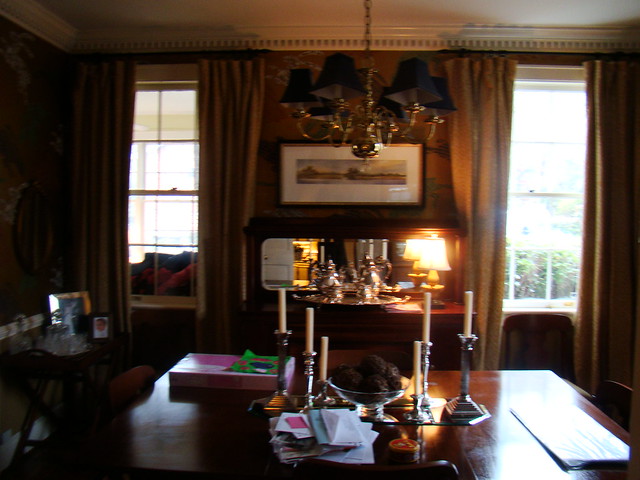
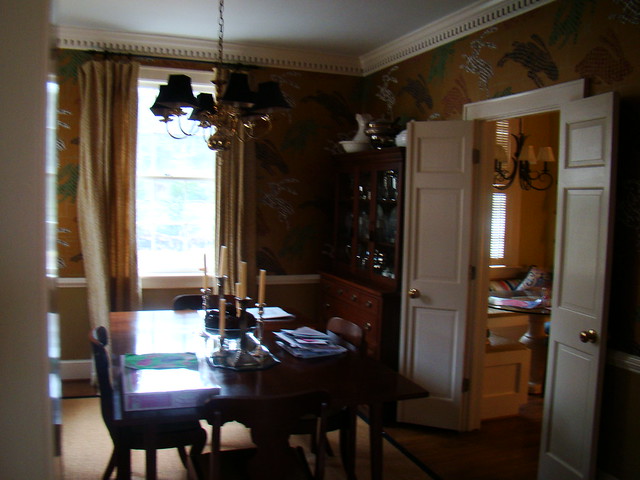
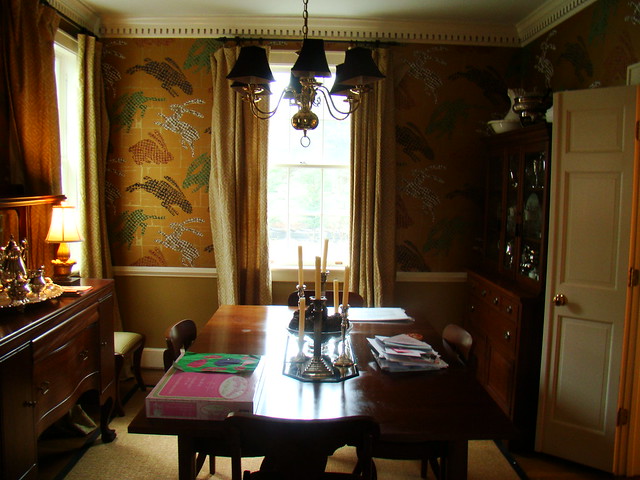
I don't know whether you all noticed in my last post...THE BUNNIES in the dining room!  The hopping bunny wallpaper.  Well, it HAD to go!  This wallpaper was inherited by my clients when they bought the home....so there were no tears shed when it was removed!  Not only was it a little creepy...large hopping bunnies surrounding you as you eat a family meal, but it was dark, and dreary, and did NOTHING for the room.  I do have to wonder what was on the previous homeowners mind when they exclaimed "oh, my gosh that is the PERFECT paper for my dining room, I must have it!'  You certainly have to have that kind of love and conviction to put something like this up.

I DO have to admit the first time I saw it, I was a little intrigued, the graphic quality of it was kind of interesting, but the more I thought about it, the more I found it.... just odd.  And not knowing that my client's weren't the ones with a a bunny obsession, I said "oh, look at the bunnies..that is so cool!"  You never know who you are going to offend, and if you can't say anything nice, don't say anything at all!  But once it was clear that it wasn't their decision, the bunny bashing began!

Here are the befores of the dining room.

This was right before they started the move.
looking into the kitchen...you can see the little eating area we removed.


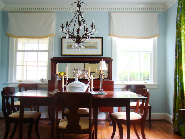
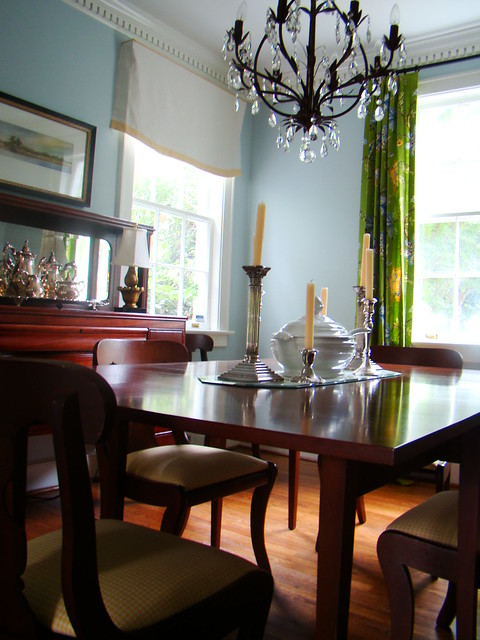
First things first.... We decided on a beautiful blue.  It is Benjamin Moore Blue Haze 1667.  It really is a pretty, in a North facing room with lots of light,  it translates into such a nice clean blue...and doesn't turn green.

TADA!  Doesn't it look huge???

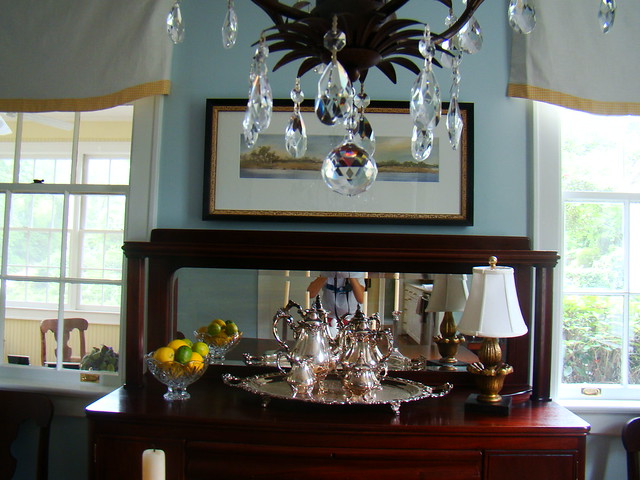
I added the cornices, A.) because the husband did not like the feeling of being draped in.  And B.) the beautiful buffet goes from window frame to frame and if there were drapes, there would be a just a sliver of light coming thru.  And then on the opposite window...the one you see when you enter from the  living room, we added beautiful drapes in a Robert Allen Print. A successful compromise, I like to make everyone happy!  The banding on the cornice and on the chairs is a really pretty yellow hounds tooth.  Doesn't this room have an elegant comfortable feel with lots of Southern Charm??


Still deciding on a rug....seagrass?


New Chandelier and inserts on the chairs.  Everything else was there before...even the candlesticks!

Can you believe this artwork was there before...it sings in the room now!

Isn't it amazing that the same furniture and artwork looks brand new paired with a new paint and fabric.  Many times people think the furniture is the problem....and in some cases it is, but in this case they just needed a new beautiful blue back drop.

So..... there you have it folks, all we had to do was banish a few bunnies to make this room one that will stand the test of time.

Happy Hump Day!

Monday, July 18, 2011

A trip down Renovation Lane.

New Kitchen and Keeping Room.

So.... I know that I have spoken before about my first clients....the kitchen/dining/bathroom/keeping room renovation that we began back in January.  Well the actual renovation was finished in May, and we have been finalizing the decor, rearranging furniture, etc.  I zhushed a bit and brought in the pillows, and slipcovers while they were on vacation last week, and ya'll it was so much fun!

I would like to share the results with you....a little trip down renovation lane...from conception to completion.


Here is the kitchen before...

the demo day...one of my favorite stops on renovation lane.

This small eating nook was to become part of the kitchen


The beginning of the project started much like projects do,(at least I am assuming, this was my first...what do I know!, HA!) with a dream of my client's and me with the eyes and vision to see it through. (and they took a chance and trusted me to help with it:)  It started with an elevation sketch, a drawing of what I thought the kitchen could be.  Ya'll a picture/drawing is worth a 1000 words.  I knew I was on the right track when the husband called me and thanked me for making him excited about a process that he was otherwise dreading...he could fiinally SEE what his kitchen MIGHT look like.  Now I know my drawing skills are not perfect by any means, but it was just enough to show that it could be something far from what it was.  AND there is just something about a hand drawing...nothing like getting out a ruler, tracing paper, and grid.

BTW: They were the best clients to work with, were able to make decisions easily, and knew what they liked and didn't like (which is sometimes half the battle)!   I was told they wanted light and bright and airy....updated traditional.

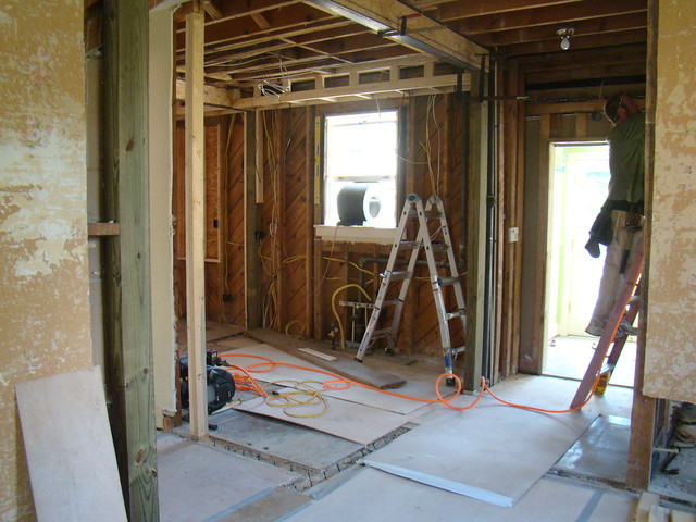
Here is the space down to the studs.
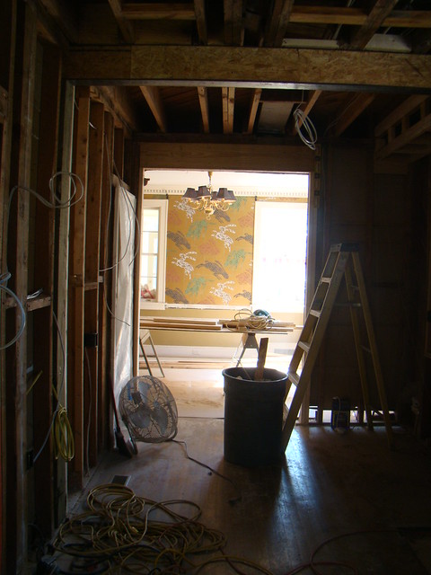
You see that beam...couldn't go, so we COFFERED the ceiling...YAY!  Nothing like letting  a home speak to you.
That was the beam that seperated the eating nook from the kitchen before.

walls came down, a bedroom was made into an eating room, and keeping room, and the bathroom door was relocated.


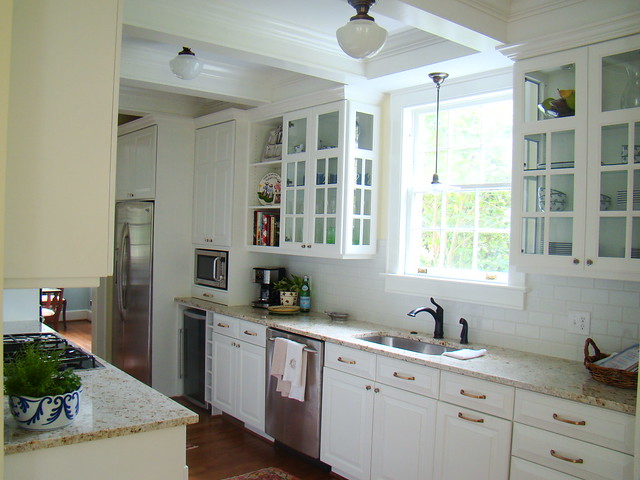
To THIS....

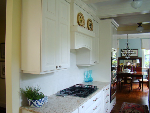
Tada!
The beauty of custom cabinetry, we were able to have side lights put in the glass cabinets.  A window was lost (where the microwave cabinet is) and I thought this would help filter the light throughout the space.  Sometimes custom cabinetry is not out of the realm of possibility.  Custom doesn't always mean MORE expensive!
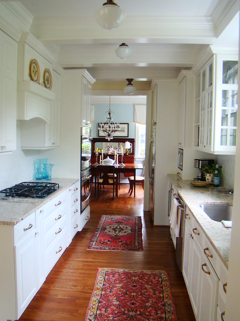
Doesn't it look so big...light and bright!
This galley kitchen looks so much bigger than it did before.
Now, ya'll I LOVE this stuff.  I loved EVERY minute of this process... My clients thought I was a bit crazy, "you get this excited about Granite and drawer pulls?"   And,  I think that they might have started to see just a little bit of how it didn't have to be a totally dreadful process. 

Seeing a design come from my head to this, is just the best!  I tell my husband that he likes to Mountain Bike and go really fast...well, design and renovation is like my endorphine rush, it is my mountain biking....without all the sweat! (well, maybe a little bit of sweat:)
Tomorrow I will show you the all of the dining room and keeping room decor.

Happy Monday!


Wednesday, July 13, 2011

No Teasers Here.

The Teester is all Hung!
The little bit of pattern on the bottom.

 But A Teester we have.  I have been calling the Cornice/Pelmet/over the bed thingy the wrong name.  It is a  Wall Teester.   And the "client" couldn't be happier.  When we got it up, she walked in hands clasped over her mouth and she said "Oh my gosh, I LOVE it!"  There are still many things to be done, but the main piece is FINISHED!  And by my own hands, thank you very much.  For all of you sewers out there...this was one of those times when everything was going my way...I think I had to just pull a couple stitches....which is NOT my usual experience.  It is leaving me saying, hmmmm, I might sew more often.   AND there are NO unfinished edges. Woo Hoo!  Oh, and I finished the pillow in like 15 minutes.  Between the time the kids were taking a bath and when they were going to bed (my husband was like, "you just did that....I don't know weather to be impressed or think you are a little nuts!"

So here is the lowdown on what I did.  The striped part is an old sheet that I have had forever,(when the color is right it's right) and the white is linen.  I just pieced it all together. Et voila!

The bedspread is a chenille spread I found for $7 buried at an antique store.  You don't find this contrast very often.  SCORE!

Now I have to hang the other curtains, and re-do the chair, and buy the floukati rug, and re-do the lamps, oh and bring in side tables.  But I think we are well on our way.

Happy Hump day!