 |
| Don't mind the Yellow Lab...Ellie in the photos. She just loves the Cowhide rug...a girl after my own heart:) |
I have finally taken photos of the "other side" of the room of my Rustic Chic Re-Style. You know the one with the 1 hour Sawhorse Table? Today, I am going to reveal the Before and Afters and the rest of the room and a few of the key details.
This room encompasses my philosophy of not under-estimating the power of a fresh coat of paint, buying a few key pieces, and then bringing back in the things that you love.
Here are the befores
An awkward floor plan...and seeing the TV right when you walk in the door.
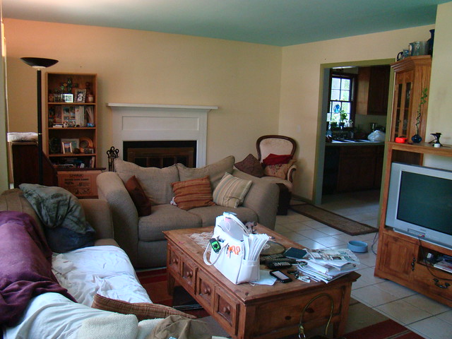 |
| This was painting day, so the dark drapes and all of the chochkies had already been removed. |
 |
| A Loveseat that blocks a whole part of the room that isn't used to it's full potential. oh, and the infamous "college lamp from the 90's!" |
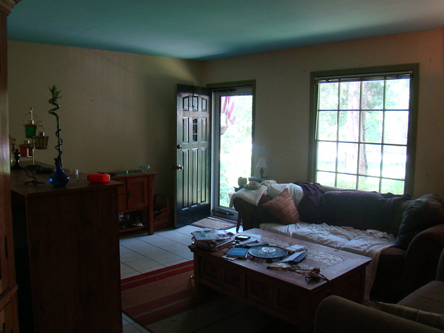 |
| The beautiful blue ceiling, yellow walls, and Green window panes. (this is one instance that green was NOT my favorite part of the room.) |
The afters.
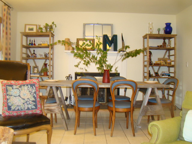 |
| The shelves are now filled with all of the personal pieces. |
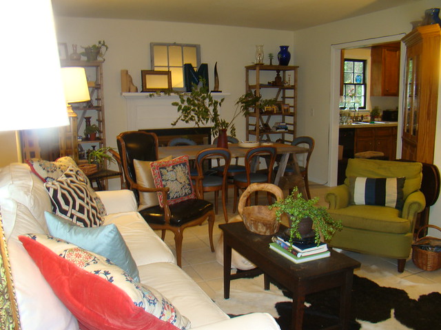 |
| Backing the suzani pillows with a pop of poppy velvet is just the punch of color we needed. |
So here were my goals for this Rustic Chic Re-Style
Paint a neutral color on walls AND ceiling.
I used Benjamin Moore Spanish White on the walls and the ceiling. This is a trick to make the room feel much larger. Then I painted the Window mullions BM Black.
Make a functional floor plan by defining the spaces into living/dining.
We relocated the dining space from the kitchen (and made the kitchen area into a little keeping room, reveal for another day. Rearranged the living room area by placing the TV on the far wall opposite the fireplace in a tv cabinet. (I didn't take a photo of this angel.) This way it isn't the first thing you see when you enter the space, but can be enjoyed from all angles. The dining area can be used for dining or as a desk the rest of the time.
Buy a few key pieces.
Luckily we could purchase a new sofa. This is the White Slipcovered Sofa from Rooms to Go.
I went to Scott Antique market and purchased the Cowhide Rug, the black spindle lamp table and decorative M for less than $500.
The lamps, coffee table (a piano bench), green chair ($10) and dining chairs were all Thrift store finds.
The French leather chair was from my favorite Consignment shop Worth Repeating.
We made a new dining table with sawhorses (meant for a canoe) from outside and a door...read about that here.
The shelves flanking the fireplace are Campaign Shelves from World Market.
Pillows and Fabric
My Client loves to travel and is very outdoorsy and totally girlly all wrapped up in one awesome package. Thus the Rustic Chic. One of the best ways to bring in the personality of the client is with fabric and pillows. I picked this suzani fabric from my local shop (I don't know product info) and had custom pillows made. The Linen ikat type Curtains were a score at $5.00 a yard from the back room at the local fabric store. I just frayed the edges and hung them totally rustic and perfect for the space. Also, hanging the drapes at the ceiling makes the room feel so much taller.
Bring in the client's pieces.
Now that we had a base, wall space and a good floor plan. Bringing in all of the thing that are unique to my client makes it totally hers. There are only a couple accessories that we bought. Most of it were things she already had, just displayed in a different way.
So there you have it folks. A Rustic Chic Re-style that suits the owner to a "T". A sophisticated, bright, and happy space with a little Rustic and a little Chic thrown in.
Oh, and I have a portfolio tab on the blog now with all of my interior projects. Click under each picture to go to the flickr streams with all the before and afters of the spaces.
Have a great week ya'll.




4 comments:
This is fantastic! Great foundation with unique pieces...thanks for sharing your ideas and philosophy, I'm guessing your client LOVES it!
Cathy @ Room Rx
Yes, I definitely love my new room! I can't wait to continue working on the rest of the house. Grethen is really gifted and I'm lucky that she took me on as her client. :)
Wow Gretchen! It doesn't even look like the same room! The fireplace was non-existent in the before photo, but now it's part of the dining/dinner party that I'm envisioning happening on the other side of the room. Great work - it's beautiful!
You are such a girl after my own heart...using what you have....pretty fabrics and lighten it up! All things that will make a room look so much better. I love what you have done and what a great use of space.
Post a Comment