 |
How things have changed, we found this in a wall....for the original windows
Pay attention to the second step...the guys on site got a huge laugh about this...hehe! |
A renovation is fraught with DECISIONS...some days I was like "if I have to make another decision, my head is going to pop off my neck!" Other days, I was like "bring it on!" but either way I felt that once the decision was made I felt much better (until I changed my mind!) Anyway, here are some of the MAJOR decisions that were made that really affected the aesthetics OR the functionality of the kitchen.
The first decision is to pick the right people...we acted as our own contractors (I know crazy, right.) But we payed a contractor to be our consultant. We payed the subs directly. This does save money, and I had the time to be AT the jobsite EVERY day...I enjoyed it....might not be for everyone! He helped us with all of the HUGE decsions, and helped keep it on track. This helped with the pocketbook, AND helped me get some of the upgrades that I wouldn't have gotten otherwise. Brian Hallman, of Hallman Construction, he was just awesome.
The next was our cabinet maker, Rayne Mueller I just can't say enough, it was this collaborative, great relationship. We had so much fun (at least I did) working together. He let me come down to the shop whenever I wanted to check on progress...and there is that moment with the columns...will get to that in a minute!
Here are a few of the MAJOR decisions....after all we are doing this in 1 week I can't touch on them ALL...it is bringing back memories!
Load Bearing Walls
When we started knocking down walls, I got a phone call saying "those 2 walls you wanted to knock down, well BOTH of them are load bearing!"WHAT, WHAT, WHAT!!! So we had to pick the lesser of the 2 evils. I KNEW I didn't want a header in the middle of my kitchen, so I HAD to reign in the kitchen design and NOT go 2 feet into the dining room as originally planned....AND there was a column that would be right in the middle of my new opening...thankfully I had months to figure out HOW I was going to deal with this. Thank goodness for blessings in disguise, I didn't NEED those extra 2 feet, AND the aesthetics of the kitchen really were driven by this one crucial moment, and I am so HAPPY it turned out the way it did.
THE COLUMN
Soooooo, THAT stupid column turned into the elephant in the room, literally. What to do with it, we went from 1 column, to 3 columns, to arches, back to column, 2 market, 2 market, 2 buy a fat pig!!! One thing that helped with this decision was taking pictures of the space, and then tracing on top of it my vision. A trick of designers. You are using the actual space, so your space is what it is....
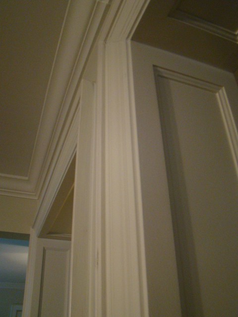
ANd then one night, the DAY the columns were to be built I thought PANELS! We will panel the opening, clean, simple, INGENIOUS! The next day I ran down to the cabinet shop screeched into the parking lot....
me: "Please tell me you didn't start the columns...
rayne: NOPE we were just getting started"....
me: YAY!!!!,
rayne: why?
me: "because I changed my mind, change them to panels instead."
rayne: "okay, how do you want them designed?"
(okay there might have been some rolling of eyes, and snickering at my ability to change my mind right at the precipice but this is how I remembered it!)
Crisis averted! Every time I look at them I smile and think....good decision Gretch!
Although when the kitchen was done and my younger brother 20 (who is a self prescribed no it all) said, don't you think the kitchen would flow better if you didn't have this stupid column"! Duh, don't you think I thought of that @!!!**$$? (please excuse the french, I might be a self prescribed potty mouth!)
ISLAND ITERATIONS
 |
| Some of my many drawings. This really helped to figure things out! |
The island was a HUGE part of the kitchen. I knew it would be great for storage, but I also wanted it to seat 4 people, and NOT all along one side. I drew that sucker up so many times....imagining my family or guests sitting there, me cooking, how were we standing? Where were we sitting? How much storage would I have? Do I gain 12" of cupboard to lose a seat....Again so happy for the sleepness nights, it is exactly as I had imagined it!
A sink CENTERed or NOT?
 |
| via gardenweb.com |
So I only had 13 feet to work with on the sink wall and wanted a 30" sink, a 36" stove, prep space, AND a window smack dab in the middle of it all...what is a girl to do?
Upload my design to
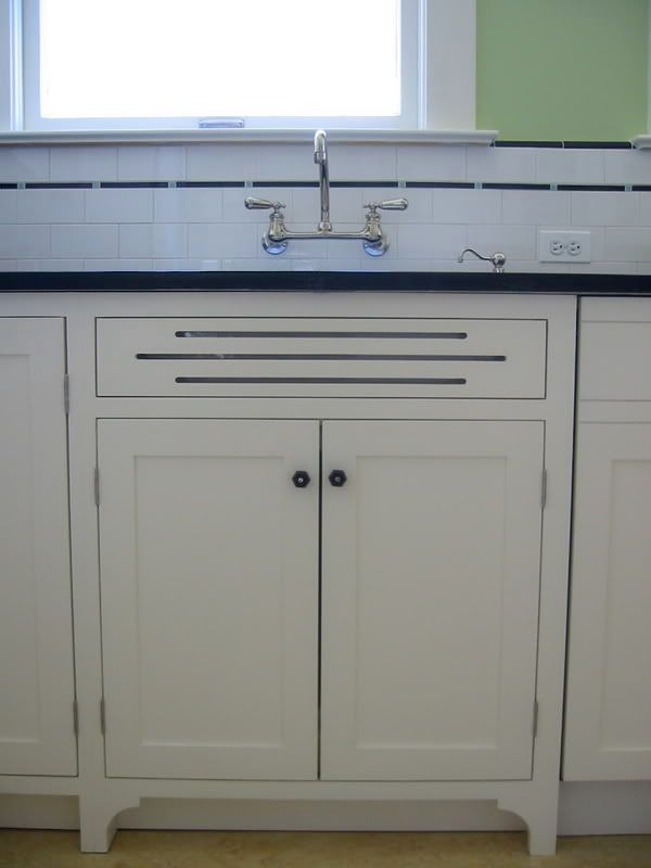
gardenweb.com of course and let it be torn apart...I mean TORN. Now, I spent many an evening with my feathers ruffled about "how dare they say they couldn't work in MY kitchen!" But when it came down to this design, someone just simply said...why don't you just move the sink? An uncentered sink? OKAY...so I moved it. AMazing how just one small adjustment could change everything. Now I have 30" of prep space AND there is space behind me while I do dishes...the flow of the space is awesome. Sometimes flow trumps aesthetics.... Who needs everything centered anyway???
One more thing that helped the decision making process....I taped off the entire space after demo and prentended to work in the space. Being careful not to Step on the island!
So those are some of the MAJOR decisions...the headache is coming back as I write!
A kitchen renovation is so important, AND it is really important that whomever helps you design your space takes EVERYTHING into consideration....luckily I was my own client and knew EXACTLY what I wanted. SO when your designer starts measuring your cookie sheets, and counting steps in your space, don't think she is crazy...more than likely you are going to get EXACTLY what you want!


 via Southern Living


