Wednesday, August 31, 2011

The Fabric is IN!

All lined up...makes me really happy!
 

Good Morning All.  I will make this short because I have a ton to do this morning, but I can't help but show you all what came in the mail yesterday.  My fabric design!  What do you think?  Florally and graphic all at the same time.  The far left 4 are in a cotton linen blend with a little bit of an off white ground...and the far right 2 are organic cotton sateen on a bright white ground.

The only color I am not super happy with is the green...but the other colors stayed pretty true to the color chart.  Always hard to get the perfect color green...but it is growing on me.  It has a bit of blue in it....and I am loving the black and white and can see it on a statement chair, or even as drapes.

The whole repeat.


Getting an itch do do some more...fun stuff!


Monday, August 29, 2011

The Suspense

I am really excited about TV today, because one of my favorite shows HGTV's Design Star


is going to be on another one of my favorite design shows The Nate Berkus Show.  


The suspense is killing me!  Now that they are down to 4 contestants, I am very interested to see how they measure up in this challenge.   This is one of the times where I can say, I kind of know how they are feeling....although, they should be pros by now!  I hope that they are as excited as I was to be on Nate, and don't let the nerves (or the audience)...or Nate's presence for that matter get to them!


Any guesses as to who will win this week?  Who is your favorite?

My guess for this week's standout to be Meg, because she seems to be so great on camera...although she  does tend to submarine herself.... and for the loser to be Kellie....just because they didn't show her in the trailer (love how producers play with your mind.) My feeling is that Karl and Marc will be in the finals....because they had a girl/girl finale last year, it is time for the males to shine.  Me playing producer again!

Anyway, you will know where I will be at 1:00 and 8:00 tonight...right in front of the TV!

(as if I didn't watch enough tv this weekend...I turned my ankle on Friday, cried like a baby, and was on the couch popping bon bons all weekend....as per the Dr.'s instructions. (not the bonbons part....but the stay off your feet part...so I let my children tend to my every need and want!! HA!, yeah right!!!!) 

Happy Monday.

Thursday, August 25, 2011

Class is in Session

via this is colossal
(Great example of graphic, interior, furniture design)

Recently, I have been asked the question quizzically "what exactly DO you do?"...Hmmm, sometimes I ask myself the SAME question! my answer usually goes something like this

  "Well, I am a freelance graphic designer by trade...so I am translating that talent into the Interior World....a dream of mine...melding the two together....I basically have been designing most of my life." (not the best elevator pitch, but it will do for now!)

Which has made me think, what makes Graphic Design "translate" into Interior Design?  I know there are some guiding principles that overlap.  So I got out my design books and started looking into it...I might innately know the principles, but I thought it might be fun to delve into it and really look at the correlation.

 And over the next month I am going to show you why Graphic Design a predominantly 2D world translates into Interiors a 3D world....with a few guiding principles.  I bet I will learn something along the way too!

Class is in session!


Tuesday, August 23, 2011

Adding to the Collected Wall

The new 'addition'
A couple of months ago I won a giveaway from Julie at Milk and Honey Home.  She was giving away letter posters from Methane Studios.   Original Screen prints...I mean, I had my fingers crossed fo sho! She will be doing another one in September, so pop on over to check it out. I of course wanted the "O", and was happy to see that the colors would go perfectly in my Den.  Seriously ya'll, with a name like OPGENORTH, (a not so perfect name, but I OWN it!) it was kind of  design serendipity that the colors would go so perfectly. So I hopped myself over to the 50% OFF frame sale at Hobby Lobby...(really, if you want frames you have to wait for these sales, they rotate every few weeks.) and bought myself a couple frames.  Oh, and another thing.  Check your receipt, because the girl at the front didn't give me my 50 on one of the frames....so I called her on it, of course, and stood in line for ANOTHER 10 minutes to rectify.  Worth all $16!

Oh, and the painting of my sweet boy, finally got the frame he deserved:) With a little cojoling from the artist/mom...she is having an art show soon and needed the artwork to be "properly" displayed. (so my collected wall, will look a little sparse for a few weeks, what am I going to do??  One of the things I love about a collected wall, is you can swap things out if you need to, and it still looks good.

Onward and upward, ya'll.


Monday, August 22, 2011

Going back to my design roots

It started off here...a drawing with "permission markers"

 The Graphic Design ones.  I have always been a lover of pattern.  All of my doodles revolve around pattern.   How they evolve and repeat it has always been my forte per say::)

Sooooo late last week, I got an itch to bring out the sharpies and start  some pattern drawing.  If I am going to do this textile thing, I need to learn to match the patterns in illustrator.  So let the practicing/obsessing begin! 

I am kind of liking them.  The stripe will be a large scale stripe...like 18-20".  Does anyone else feel like the "right" striped fabric is always elusive, whether it is the colors or the scale, I am never quite happy when it comes to stripes.  I think I am going to design my own from NOW on!

Starting to feel like this textile design stuff is kind of fun.

Happy Monday!


Wednesday, August 17, 2011

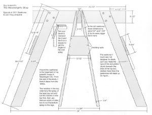
Sawhorse Table

A closeup of my most recent creation.

 Has anyone else noticed the sawhorse tables are everywhere?

via Southern Living


via decorpad

unknown
unknown
via FunkyJunk Interiors
Now that is good idea!

via Remodelista

I personally really like them, I think they are functional in most spaces, can be used as a desk or a dining table...they can be modified easily, wood on top, glass on top, zinc top, marble top....you get the idea:)

Well recently, during a friend/client install/zhush (a very rushed, need to have this done because we are having a party in a couple hours zhush.)  I looked around the corner of the driveway and saw some sawhorses....I had an AhHAH moment, if ever there was one.  The next conversation went something like this.

I ran inside and said...."Are you using those Sawhorses for anything?"

"Well, we were going to use it for the canoe, but as you can see..."

I interrupted the thought (this is a friend and I can do rude things like that!) And said "I just found your table."

The reaction was, "I thought we were using the other one."

"Well, I just found a better option, Trust me."

"you know we have a party in a few hours, but I trust you."

Thank goodness for friends/clients that trust, because I was able to pull it off, and it is FABULOUS!!!!  A beautiful table for $26!!!!  $26 you ask...no way.  Yes, way!!!! and the money is in the top.  It looked like this when I bought it.

Hollow Core Door from Lowes $26


Voila!!!!  Table for 6 or 8


2 hours before guests were to arrive, I decided to paint it.  There was doubt in everyone's eyes.  First I mixed leftover wall paint with water to get a whitish base, and then I went over it with leftover black paint mixed with water.  All with a rag.  It totally goes with the real worn sawhorse bases. 


Here is me saying
"Um, yeah...I just finished this 2 hours ago...please remember to use a coaster:)"

What is great about this table, is that it will double as a desk.  The cool black leather chair on the side will be behind it, and a lamp(s) will be added on the side.  Versatility at it's best!

It really adds to the rustic/chic vibe we are going for in the space. 


Most out of the box retailers have created some version of the sawhorse legs and table from under $50 to A couple thousand.


via Williams and Sonoma $1350
via Amazon.com $45
via Ikea $39.99
OR you can buy yourself some 2 by fours (or find some old worn decking on the road) and build some of your own the world is your "sawhorse" oyster!

14 plans for Sawhorses


Oh, and FYI I am on the rerun of Nate again today.  My 5 minutes of fame has been extended to 10!


Monday, August 15, 2011

Double Take.


Good Monday Morning All.  A little bit of an emotional morning, just dropped my girl off at her first day of 1st grade!  Really, time flys. SIGH:)

Now, there are no excuses for not blogging, I have all the time in the world, right?

Since I woke up at the crack of dawn, and already had most things done (ie lunch packed, breakfast made) and the kids hadn't woken up yet.  I had a couple minutes to myself.  So, what does a girl do with a couple extra minutes, she opens the closest Design mag she has....the July/August issue of House Beautiful.  As I was flipping through I came to one of my ALL time FAVORITE rooms in magazine.  The Nick Olson Studio Apartment.  Now, that green just takes the cake.  I LOVE everything about this room. 

But there was something just a little different when I flipped through, that I had a Double Take moment.

Everything about this room is beautiful.  I Want curtains, pleated like that.

The fabric on the headboard and dust ruffle...it reminded me of something, something that has been sitting in the back of the car since our trip to DC.  A roll of vintage hand printed fabric that I scored for $20 at that estate sale in Georgetown.  I KNEW i was drawn to it for a reason.


I quickly looked at the source...Schumacher Hong Kong Fabric, but mine says


So, the question is this.  "Is this the original vintage fabric?"  It doesn't say Schumacher anywhere on the fabric...it says Patterson Fabric.  And the printing is obviously Hand Printed....and just gorgeous. 

So, needless to say, I am tickled that I have this fabric.  And feel extra special, I may have something original that Schumacher re-printed.  So, the question now is..."where in the world will I use it?"

Happy Monday.


Tuesday, August 9, 2011

FLANtastic!


I have to admit, the flowers from yesterday's post were for a reason...I had the flagship meeting of a few friends for our new Supper Club.  Here is how it works...The Hostess picks a cookbook, and makes the main course and everyone picks a dish from the book to make and bring.  I picked Alice Waters The Simple Art of Food.  Such a great cookbook... simple food is the best food. It was so much fun, and all of the Food was Delish.

Not being a real cookbook follower myself (I make things up as I go along, go figure:)) it was fun to go by a recipe...I made a few things I never had before...Pork Carnitas, Homemade Tortillas, and FLAN!  You would think the Flan would be where I failed, but it Turned out!!!!  It was amazing that this little flan made it thru, when they say take it out when jiggly, they mean jiggly!  I made the caramel, did the water bath, and thought I had failed big time when the water bath boiled over into the flan...but I just trudged on, thinking it would be a Huge mess when I turned it out onto the plate....I think I shreaked..."Oh, my gosh!" when all of the sauce fell out on top of the jiggly custard!  But, evidently that was how it was supposed to be.   Feeling so good about myself, I might try out for Next Food Network Star!

The Flan...just removed from the dish....didn't know that there would be so much sauce...THAT was a  surprise!


Mmmmm, mmmmm!
Here are some more stars of the evening....really it was ALL good, and I was more busy eating than taking photos.  I think I got most of it, except the beans and rice...which were excellent too and should have gotten a photo!

Sangria Anyone....this is great because it can be made by the glass instead of a huge vat!

Preparation of the Delicious Rice.

Yummy Guacamole....in my old vintage orange serving pieces.  I bring them out for mexican meals!

Is your mouth watering yet....Gazpacho....perfect in this heat!

A Nice big Carnita Burrito with ALL the fixins...and my attempt at Tortillas in the Background....
Made for better dippers than Burrito wraps.  Thank goodness I had a back up!

I love to set a table....going with the theme of simple and in-season, I picked the Black Eyed Susans as my centerpiece.  Determined to use what I had, and tired of my same old place mats,   I decided to use the cardboard seperators from the tons of paper samples that I have gotten, they were the perfect size....I KNEW they would come in handy some day.

I love a good Bird's Eye View

Burlap and Cardboard. and white china...Can you get any more simple??

My mother-in-law gifted me 5 vintage monogrammed Dinner Napkins with her maiden name initial "B".
I think that any monogram is pretty, even if it isn't your own.

Just another view.


So, I didn't get organized yesterday, but I managed to be a part of a Real Simple meal that was Simply Delicious!  AND to top it all off, I made FLAN....it was all just FLANtastic!  Ha, ha!  Can't wait for our next get together in September.